Controls reference
Flet UI is built of controls. Controls are organized into hierarchy, or a tree, where each control has a parent (except Page) and container controls like Column, Dropdown can contain child controls, for example:
Page
 ├─ TextField
 ├─ Dropdown
 │   ├─ Option
 │   └─ Option
 └─ Row
     ├─ ElevatedButton
     └─ ElevatedButton
Controls by categories
🗃️ Layout
22 items
🗃️ Navigation
8 items
🗃️ Information Displays
12 items
🗃️ Buttons
18 items
🗃️ Input and Selections
16 items
🗃️ Dialogs, Alerts and Panels
13 items
🗃️ Charts
5 items
🗃️ Animations
3 items
🗃️ Utility
22 items
Common control properties
Flet controls have the following properties:
adaptive
adaptive property can be specified for a control in the following cases:
-
A control has matching Cupertino control with similar functionality/presentation and graphics as expected on iOS/macOS. In this case, if
adaptiveisTrue, either Material or Cupertino control will be created depending on the target platform.These controls have their Cupertino analogs and
adaptiveproperty: -
A control has child controls. In this case
adaptiveproperty value is passed on to its children that don't have theiradaptiveproperty set.The following container controls have
adaptiveproperty:
bottom
Effective inside Stack only. The distance that the child's bottom edge is inset from the bottom of the stack.
data
Arbitrary data that can be attached to a control.
disabled
Every control has disabled property which is False by default - control and all its children are enabled.
disabled property is mostly used with data entry controls like TextField, Dropdown, Checkbox, buttons.
However, disabled could be set to a parent control and its value will be propagated down to all children recursively.
For example, if you have a form with multiple entry controls you can disable them all together by disabling container:
c = ft.Column(controls=[
    ft.TextField(),
    ft.TextField()
])
c.disabled = True
page.add(c)
expand
When a child Control is placed into a Column or a Row you can "expand" it to fill the available space. expand property could be a boolean value (True - expand control to fill all available space) or an integer - an "expand factor" specifying how to divide a free space with other expanded child controls.
For more information and examples about expand property see "Expanding children" sections in Column or Row.
expand_loose
Effective only if expand is True.
If expand_loose is True, the child control of a Column or a Row will be given the flexibility to expand to fill the available space in the main axis (e.g., horizontally for a Row or vertically for a Column), but will not be required to fill the available space.
The default value is False.
Here is the example of Containers placed in Rows with expand_loose = True:
import flet as ft


class Message(ft.Container):
    def __init__(self, author, body):
        super().__init__()
        self.content = ft.Column(
            controls=[
                ft.Text(author, weight=ft.FontWeight.BOLD),
                ft.Text(body),
            ],
        )
        self.border = ft.border.all(1, ft.colors.BLACK)
        self.border_radius = ft.border_radius.all(10)
        self.bgcolor = ft.colors.GREEN_200
        self.padding = 10
        self.expand = True
        self.expand_loose = True


def main(page: ft.Page):
    chat = ft.ListView(
        padding=10,
        spacing=10,
        controls=[
            ft.Row(
                alignment=ft.MainAxisAlignment.START,
                controls=[
                    Message(
                        author="John",
                        body="Hi, how are you?",
                    ),
                ],
            ),
            ft.Row(
                alignment=ft.MainAxisAlignment.END,
                controls=[
                    Message(
                        author="Jake",
                        body="Hi I am good thanks, how about you?",
                    ),
                ],
            ),
            ft.Row(
                alignment=ft.MainAxisAlignment.START,
                controls=[
                    Message(
                        author="John",
                        body="Lorem Ipsum is simply dummy text of the printing and typesetting industry. Lorem Ipsum has been the industry's standard dummy text ever since the 1500s, when an unknown printer took a galley of type and scrambled it to make a type specimen book.",
                    ),
                ],
            ),
            ft.Row(
                alignment=ft.MainAxisAlignment.END,
                controls=[
                    Message(
                        author="Jake",
                        body="Thank you!",
                    ),
                ],
            ),
        ],
    )

    page.window.width = 393
    page.window.height = 600
    page.window.always_on_top = False

    page.add(chat)


ft.app(main)
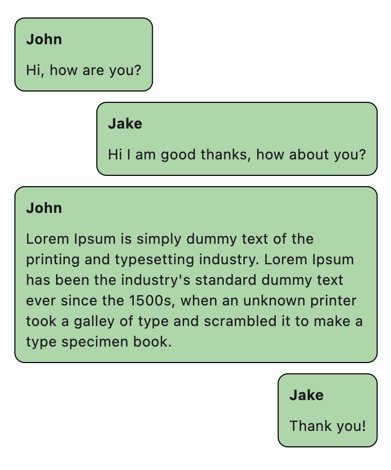
height
Imposed Control height in virtual pixels.
left
Effective inside Stack only. The distance that the child's left edge is inset from the left of the stack.
parent
Points to the direct ancestor(parent) of this control.
It defaults to None and will only have a value when this control is mounted (added to the page tree).
The Page control (which is the root of the tree) is an exception - it always has parent=None.
right
Effective inside Stack only. The distance that the child's right edge is inset from the right of the stack.
top
Effective inside Stack only. The distance that the child's top edge is inset from the top of the stack.
visible
Every control has visible property which is True by default - control is rendered on the page. Setting visible to False completely prevents control (and all its children if any) from rendering on a page canvas. Hidden controls cannot be focused or selected with a keyboard or mouse and they do not emit any events.
width
Imposed Control width in virtual pixels.
Transformations
offset
Applies a translation transformation before painting the control.
The translation is expressed as a transform.Offset scaled to the control's size. For example, an Offset with a x of 0.25 will result in a horizontal translation of one quarter the width of the control.
The following example displays container at 0, 0 top left corner of a stack as transform applies -1 * 100, -1 * 100 (offset * control_size) horizontal and vertical translations to the control:
import flet as ft

def main(page: ft.Page):

    page.add(
        ft.Stack(
            [
                ft.Container(
                    bgcolor="red",
                    width=100,
                    height=100,
                    left=100,
                    top=100,
                    offset=ft.transform.Offset(-1, -1),
                )
            ],
            width=1000,
            height=1000,
        )
    )

ft.app(main)
opacity
Defines the transparency of the control.
Value ranges from 0.0 (completely transparent) to 1.0 (completely opaque without any transparency) and defaults
to 1.0.
rotate
Transforms control using a rotation around the center.
The value of rotate property could be one of the following types:
number- a rotation in clockwise radians. Full circle360°ismath.pi * 2radians,90°ispi / 2,45°ispi / 4, etc.transform.Rotate- allows to specify rotationangleas well asalignment- the location of rotation center.
For example:
ft.Image(
    src="https://picsum.photos/100/100",
    width=100,
    height=100,
    border_radius=5,
    rotate=Rotate(angle=0.25 * pi, alignment=ft.alignment.center_left)
)
scale
Scale control along the 2D plane. Default scale factor is 1.0 - control is not scaled. 0.5 - the control is twice smaller, 2.0 - the control is twice larger.
Different scale multipliers can be specified for x and y axis, but setting Control.scale property to an instance of transform.Scale class:
from dataclasses import field

class Scale:
    scale: float = field(default=None)
    scale_x: float = field(default=None)
    scale_y: float = field(default=None)
    alignment: Alignment = field(default=None)
Either scale or scale_x and scale_y could be specified, but not all of them, for example:
ft.Image(
    src="https://picsum.photos/100/100",
    width=100,
    height=100,
    border_radius=5,
    scale=Scale(scale_x=2, scale_y=0.5)
)