Radio
Radio buttons let people select a single option from two or more choices.
Examples
Basic RadioGroup
- Python
import flet as ft

def main(page):
  def button_clicked(e):
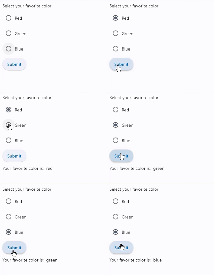
    t.value = f"Your favorite color is:  {cg.value}"
    page.update()

  t = ft.Text()
  b = ft.ElevatedButton(text='Submit', on_click=button_clicked)
  cg = ft.RadioGroup(content=ft.Column([
    ft.Radio(value="red", label="Red"),
    ft.Radio(value="green", label="Green"),
    ft.Radio(value="blue", label="Blue")]))

  page.add(ft.Text("Select your favorite color:"), cg, b, t)

ft.app(main)
RadioGroup with on_change event
- Python
import flet as ft

def main(page):
  def radiogroup_changed(e):
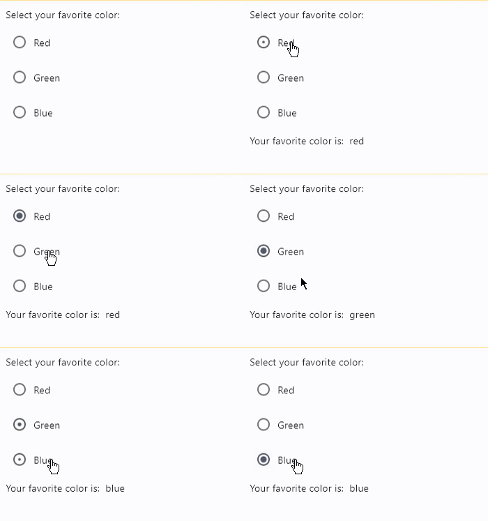
    t.value = f"Your favorite color is:  {e.control.value}"
    page.update()

  t = ft.Text()
  cg = ft.RadioGroup(content=ft.Column([
    ft.Radio(value="red", label="Red"),
    ft.Radio(value="green", label="Green"),
    ft.Radio(value="blue", label="Blue")]), on_change=radiogroup_changed)

  page.add(ft.Text("Select your favorite color:"), cg, t)

ft.app(main)
RadioGroup properties
content
The content of the RadioGroup. Typically a list of Radio controls nested in a container control, e.g. Column, Row.
value
Current value of the RadioGroup.
RadioGroup events
on_change
Fires when the state of the RadioGroup is changed.
Radio properties
active_color
The color used to fill this radio when it is selected.
adaptive
If the value is True, an adaptive Radio is created based on whether the target platform is iOS/macOS.
On iOS and macOS, a CupertinoRadio is created, which has matching functionality and presentation as Radio, and the graphics as expected on iOS. On other platforms, a Material Radio is created.
Defaults to False.
autofocus
True if the control will be selected as the initial focus. If there is more than one control on a page with autofocus set, then the first one added to the page will get focus.
fill_color
The color that fills the radio, in all or
specific ControlState states.
focus_color
The color of this radio when it has the input focus.
hover_color
The color of this radio when it is hovered.
label
The clickable label to display on the right of a Radio.
label_style
The label's style.
Value is of type TextStyle.
label_position
Value is of type LabelPosition and defaults to LabelPosition.RIGHT.
mouse_cursor
The cursor to be displayed when a mouse pointer enters or is hovering over this control.
Value is of type MouseCursor.
overlay_color
The overlay color of this radio in all or
specific ControlState states.
splash_radius
The splash radius of the circular Material ink response.
toggleable
Set to True if this radio button is allowed to be returned to an indeterminate state by selecting it again when selected.
value
The value to set to containing RadioGroup when the radio is selected.
visual_density
Defines how compact the radio's layout will be.
Value is of type ThemeVisualDensity.
Radio events
on_blur
Fires when the control has lost focus.
on_focus
Fires when the control has received focus.