CupertinoCheckbox
A macOS style checkbox. Checkbox allows to select one or more items from a group, or switch between two mutually exclusive options (checked or unchecked, on or off).
Examples
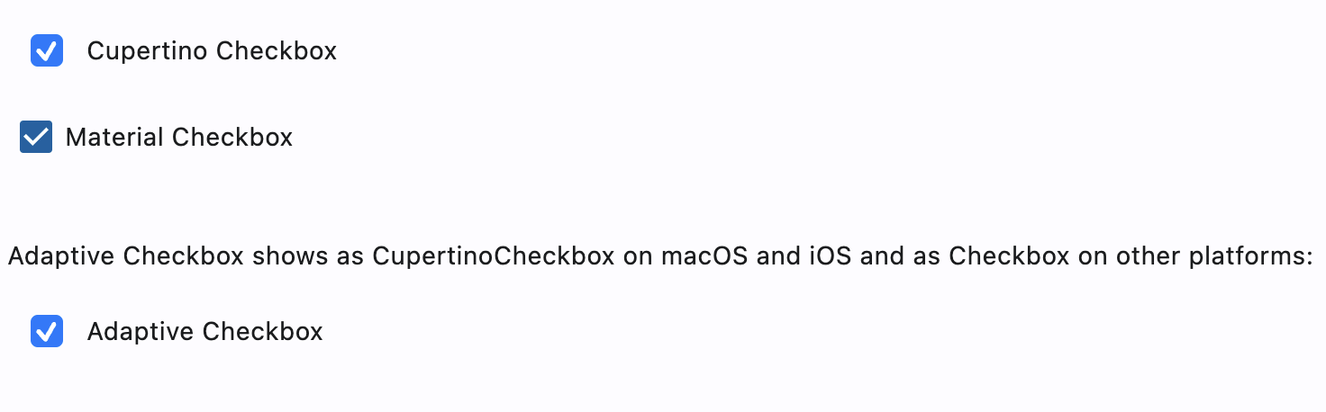
CupertinoCheckbox and adaptive CheckBox example
- Python
import flet as ft

def main(page: ft.Page):
    page.add(
        ft.CupertinoCheckbox(label="Cupertino Checkbox", value=True),
        ft.Checkbox(label="Material Checkbox", value=True),
        ft.Container(height=20),
        ft.Text(
            "Adaptive Checkbox shows as CupertinoCheckbox on macOS and iOS and as Checkbox on other platforms:"
        ),
        ft.Checkbox(adaptive=True, label="Adaptive Checkbox", value=True),
    )

ft.app(main)
Properties
autofocus
True if the control will be selected as the initial focus. If there is more than one control on a page with autofocus set, then the first one added to the page will get focus.
check_color
The color to use for the check icon when this checkbox is checked.
active_color
The color used to fill checkbox when it is checked.
inactive_color
The color used for checkbox's border when the checkbox is inactive.
focus_color
The color used for the checkbox's border shadow when it has the input focus.
label
The clickable label to display on the right of a checkbox.
label_position
Defines on which side of the checkbox the label should be shown.
Value is of type LabelPosition and defaults to RIGHT.
tristate
If True the checkbox's value can be True, False, or None.
Checkbox displays a dash when its value is null.
value
Current value of the checkbox.
Events
on_blur
Fires when the control has lost focus.
on_change
Fires when the state of the Checkbox is changed.
on_focus
Fires when the control has received focus.