CupertinoSegmentedButton
An iOS-style segmented button.
Examples
Basic Example
- Python
import flet as ft

def main(page):
    page.theme_mode = ft.ThemeMode.LIGHT

    page.add(
        ft.CupertinoSegmentedButton(
            selected_index=1,
            selected_color=ft.colors.RED_400,
            on_change=lambda e: print(f"selected_index: {e.data}"),
            controls=[
                ft.Text("One"),
                ft.Container(
                    padding=ft.padding.symmetric(0, 30),
                    content=ft.Text("Two"),
                ),
                ft.Container(
                    padding=ft.padding.symmetric(0, 10),
                    content=ft.Text("Three"),
                ),
            ],
        ),
    )

ft.app(main)
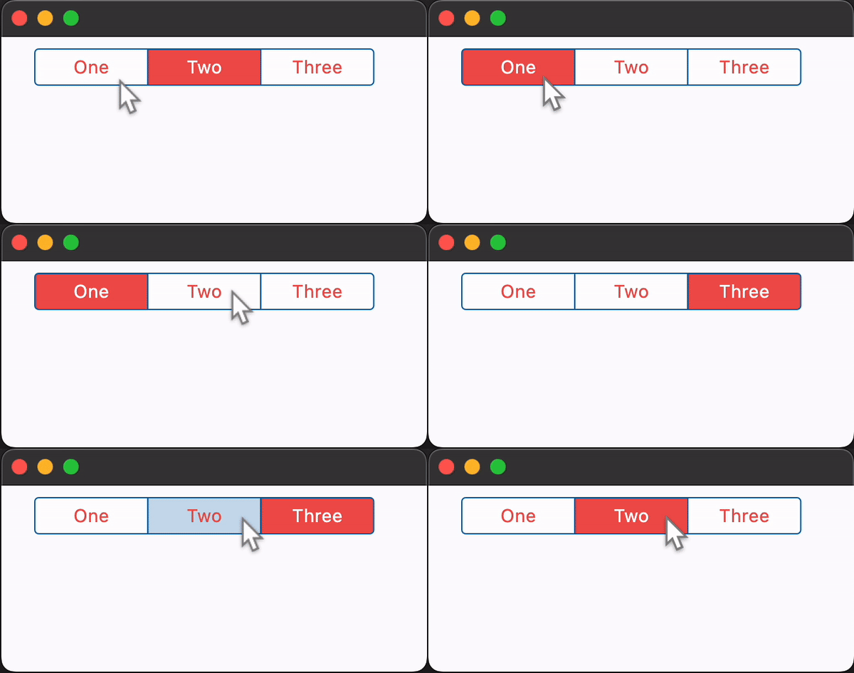
Properties
border_color
The color of the button's border.
click_color
The color used to fill the background of this control when temporarily interacting with through a long press or drag.
Defaults to the selected_color with 20% opacity.
controls
A list of Controls to display as segments inside the CupertinoSegmentedButton.
padding
The button's padding. Padding value is an instance of Padding class.
selected_color
The color of the button when it is selected.
selected_index
The index (starting from 0) of the selected segment in the controls list.
text
The text to be shown in the button. In case both text and content are provided, then content will be used.
trailing_icon
An optional icon to display at the right of the text or content control.
unselected_color
The color of the button when it is not selected.
Events
on_change
Fires when the state of the button is changed - when one of the controls is clicked.