ElevatedButton
Elevated buttons are essentially filled tonal buttons with a shadow. To prevent shadow creep, only use them when absolutely necessary, such as when the button requires visual separation from a patterned background. See Material 3 buttons for more info.
Examples
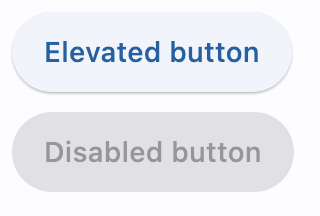
Basic elevated buttons
- Python
import flet as ft

def main(page: ft.Page):
    page.title = "Basic elevated buttons"
    page.add(
        ft.ElevatedButton(text="Elevated button"),
        ft.ElevatedButton("Disabled button", disabled=True),
    )

ft.app(main)
Elevated buttons with icons
- Python
import flet as ft


def main(page: ft.Page):
    page.title = "Elevated buttons with icons"
    page.add(
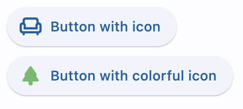
        ft.ElevatedButton("Button with icon", icon="chair_outlined"),
        ft.ElevatedButton(
            "Button with colorful icon",
            icon="park_rounded",
            icon_color="green400",
        ),
    )

ft.app(main)
Elevated button with click event
- Python
import flet as ft

def main(page: ft.Page):
    page.title = "Elevated button with 'click' event"

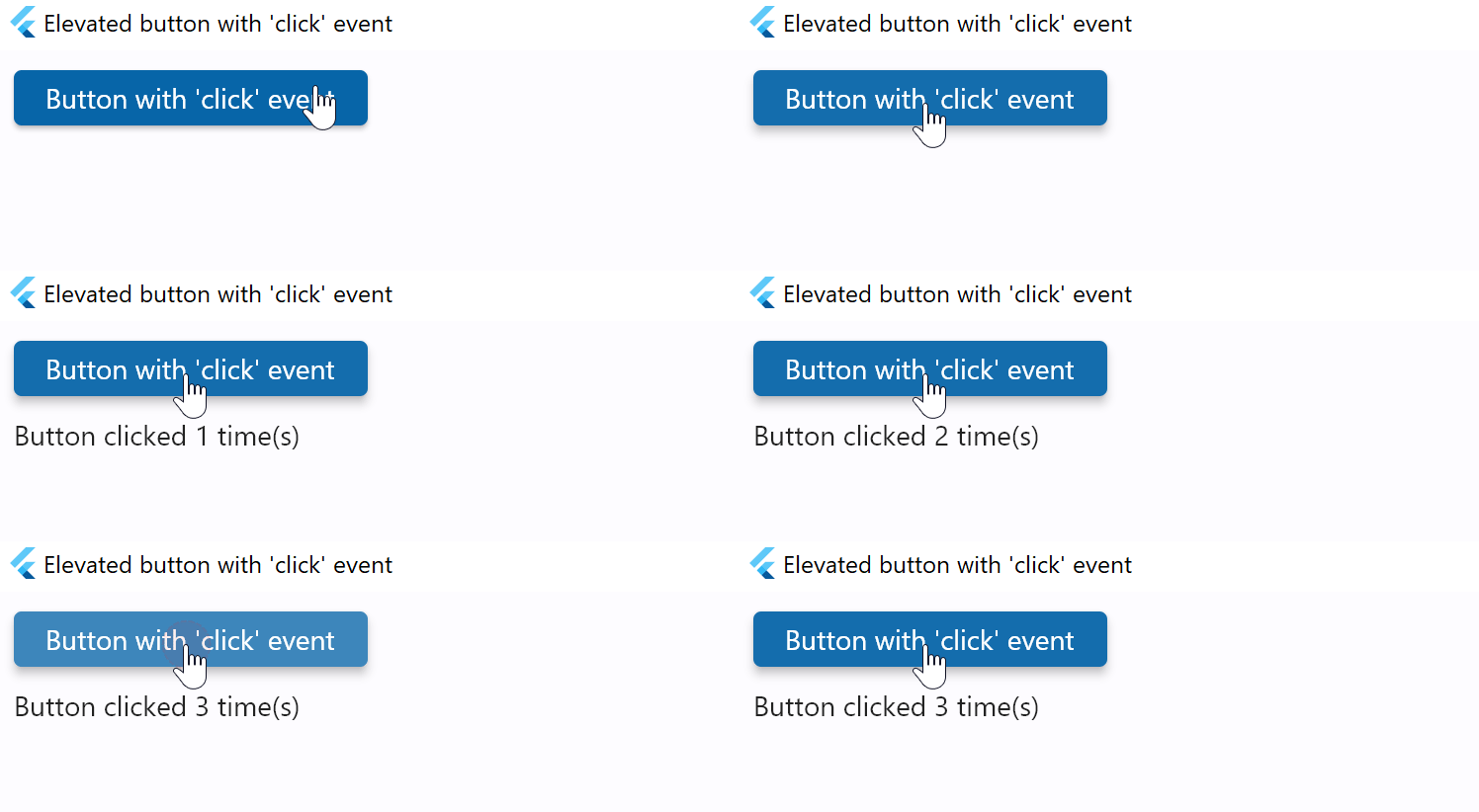
    def button_clicked(e):
        b.data += 1
        t.value = f"Button clicked {b.data} time(s)"
        page.update()

    b = ft.ElevatedButton("Button with 'click' event", on_click=button_clicked, data=0)
    t = ft.Text()

    page.add(b, t)

ft.app(main)
Elevated button with custom content
- Python
import flet as ft

def main(page: ft.Page):
    page.title = "Elevated buttons with custom content"
    page.add(
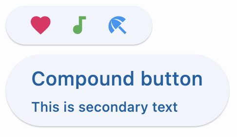
        ft.ElevatedButton(
            width=150,
            content=ft.Row(
                [
                    ft.Icon(name=ft.icons.FAVORITE, color="pink"),
                    ft.Icon(name=ft.icons.AUDIOTRACK, color="green"),
                    ft.Icon(name=ft.icons.BEACH_ACCESS, color="blue"),
                ],
                alignment=ft.MainAxisAlignment.SPACE_AROUND,
            ),
        ),
        ft.ElevatedButton(
            content=ft.Container(
                content=ft.Column(
                    [
                        ft.Text(value="Compound button", size=20),
                        ft.Text(value="This is secondary text"),
                    ],
                    alignment=ft.MainAxisAlignment.CENTER,
                    spacing=5,
                ),
                padding=ft.padding.all(10),
            ),
        ),
    )

ft.app(main)
Properties
adaptive
If the value is True, an adaptive button is created based on whether the target platform is iOS/macOS.
On iOS and macOS, a CupertinoButton is created, which matches the functionality and presentation of this button. On other platforms, a Material ElevatedButton is created.
Defaults to False.
autofocus
True if the control will be selected as the initial focus. If there is more than one control on a page with autofocus set, then the first one added to the page will get focus.
bgcolor
Button's background color.
clip_behavior
The content will be clipped (or not) according to this option.
Value is of type ClipBehavior and defaults to ClipBehavior.NONE.
color
Button's text color.
content
A Control representing custom button content.
elevation
Button's elevation.
icon
Icon shown in the button.
icon_color
Icon color.
style
The value is an instance of ButtonStyle class.
text
The text displayed on a button.
tooltip
The text displayed when hovering the mouse over the button.
url
The URL to open when the button is clicked. If registered, on_click event is fired after that.
url_target
Where to open URL in the web mode.
Value is of type UrlTarget and defaults to UrlTarget.BLANK.
Methods
focus()
Moves focus to a button.
Events
on_blur
Fires when the control has lost focus.
on_click
Fires when a user clicks the button.
on_focus
Fires when the control has received focus.
on_hover
Fires when a mouse pointer enters or exists the button response area. data property of event object contains true (string) when cursor enters and false when it exits.
import flet as ft

def main(page: ft.Page):
    def on_hover(e):
        e.control.bgcolor = "orange" if e.data == "true" else "yellow"
        e.control.update()

    page.add(
        ft.ElevatedButton(
            "I'm changing color on hover", bgcolor="yellow", on_hover=on_hover
        )
    )

ft.app(main)
on_long_press
Fires when the button is long-pressed.