PopupMenuButton
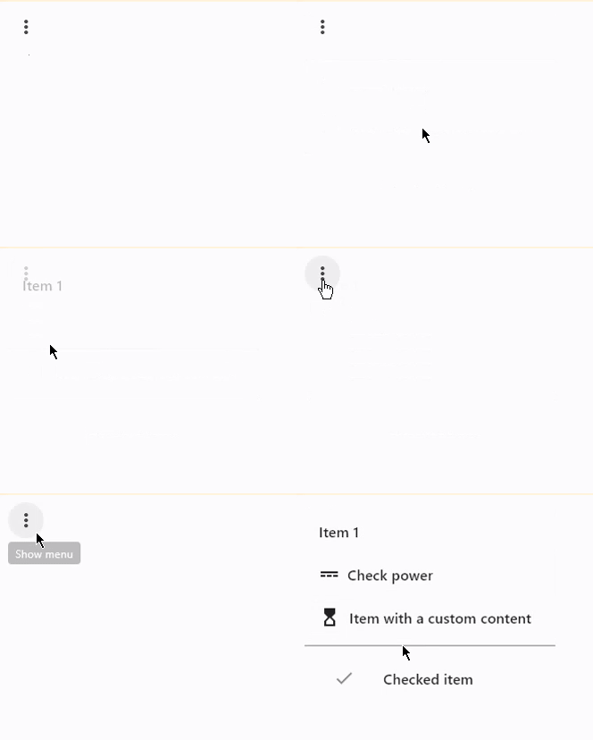
An icon button which displays a menu when clicked.
Examples
PopupMenuButton
- Python
import flet as ft

def main(page: ft.Page):
    def check_item_clicked(e):
        e.control.checked = not e.control.checked
        page.update()

    pb = ft.PopupMenuButton(
        items=[
            ft.PopupMenuItem(text="Item 1"),
            ft.PopupMenuItem(icon=ft.icons.POWER_INPUT, text="Check power"),
            ft.PopupMenuItem(
                content=ft.Row(
                    [
                        ft.Icon(ft.icons.HOURGLASS_TOP_OUTLINED),
                        ft.Text("Item with a custom content"),
                    ]
                ),
                on_click=lambda _: print("Button with a custom content clicked!"),
            ),
            ft.PopupMenuItem(),  # divider
            ft.PopupMenuItem(
                text="Checked item", checked=False, on_click=check_item_clicked
            ),
        ]
    )
    page.add(pb)

ft.app(main)
PopupMenuButton Properties
bgcolor
The menu's background color.
clip_behavior
The content will be clipped (or not) according to this option.
Value is of type ClipBehavior and defaults to ClipBehavior.NONE.
content
A Control that will be displayed instead of "more" icon.
elevation
The menu's elevation when opened.
Defaults to 8.
enable_feedback
Whether detected gestures should provide acoustic and/or haptic feedback. On Android, for example, setting this to True produce a click sound and a long-press will produce a short vibration.
Defaults to True.
icon
If provided, an icon to draw on the button.
icon_color
The icon's color.
icon_size
The icon's size.
items
A collection of PopupMenuItem controls to display in a dropdown menu.
menu_position
Defines position of the popup menu relative to the button.
Value is of type PopupMenuPosition and defaults
to PopupMenuPosition.OVER.
padding
Value is of type Padding and defaults to padding.all(8.0).
shadow_color
The color used to paint the shadow below the menu.
shape
The menu's shape.
Value is of type OutlinedBorder and defaults to CircleBorder(radius=10.0).
splash_radius
The splash radius.
surface_tint_color
The color used as an overlay on color to indicate elevation.
PopupMenuButton Events
on_cancelled
on_cancelledCalled when the user dismisses/cancels the popup menu without selecting an item.
Deprecated (renamed) in v0.22.0 and will be removed in v0.26.0. Use on_cancel instead.
on_cancel
Called when the user dismisses/cancels the popup menu without selecting an item.
on_open
Called when the popup menu is shown.
PopupMenuItem Properties
check
If set to True or False a menu item draws a checkmark.
content
A Control representing custom content of this menu item. If specified, then both icon and text properties are ignored.
height
The minimum height of this menu item.
Defaults to 40.
icon
An icon to draw before the text label of this menu item.
mouse_cursor
The cursor to be displayed when a mouse pointer enters or is hovering over this control.
Value is of type MouseCursor.
padding
The padding of this menu item. Note that the height value of this menu item may influence the applied padding. For example, If a height greater than the height of the sum of the padding and a content is provided, then the padding's effect will not be visible.
Padding value is an instance of Padding class.
Defaults to padding.symmetric(horizontal=12).
text
The text label of this menu item.
PopupMenuItem Events
on_click
Called when a user clicks a this menu item.