TextButton
Text buttons are used for the lowest priority actions, especially when presenting multiple options. Text buttons can be placed on a variety of backgrounds. Until the button is interacted with, its container isn’t visible. See Material 3 buttons for more info.
Examples
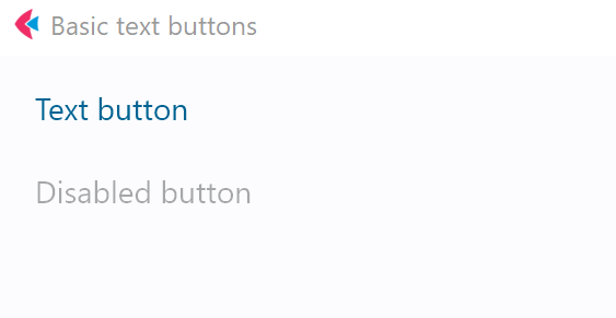
Basic text buttons
- Python
import flet as ft


def main(page: ft.Page):
    page.title = "Basic text buttons"
    page.add(
        ft.TextButton(text="Text button"),
        ft.TextButton("Disabled button", disabled=True),
    )


ft.app(main)
Text buttons with icons
- Python
import flet as ft


def main(page: ft.Page):
    page.title = "Text buttons with icons"
    page.add(
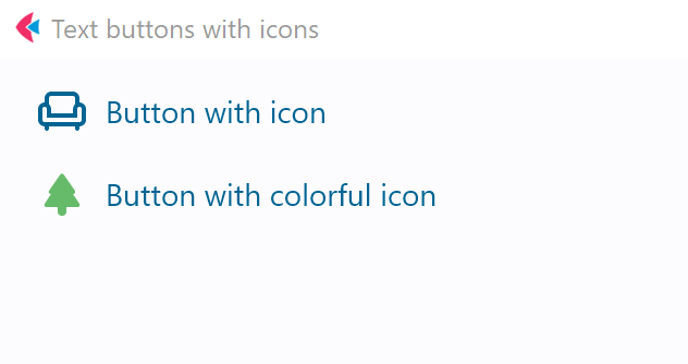
        ft.TextButton("Button with icon", icon="chair_outlined"),
        ft.TextButton(
            "Button with colorful icon",
            icon="park_rounded",
            icon_color="green400",
        ),
    )

ft.app(main)
Text button with click event
- Python
import flet as ft


def main(page: ft.Page):
    page.title = "Text button with 'click' event"

    def button_clicked(e):
        b.data += 1
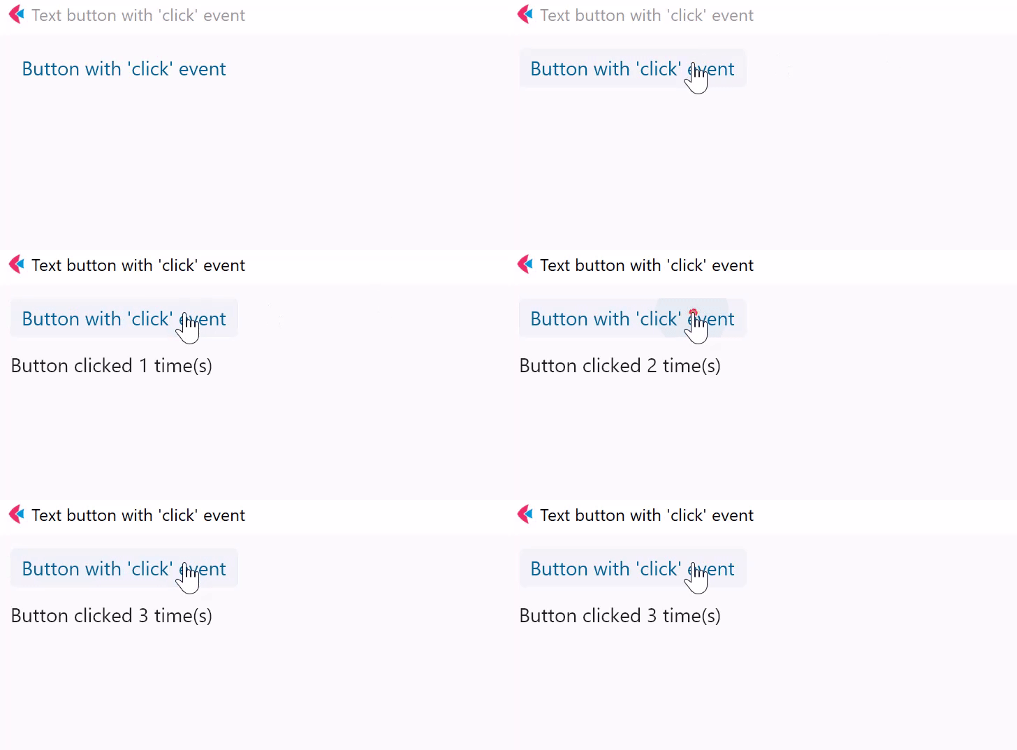
        t.value = f"Button clicked {b.data} time(s)"
        page.update()

    b = ft.TextButton("Button with 'click' event", on_click=button_clicked, data=0)
    t = ft.Text()

    page.add(b, t)

ft.app(main)
Text button with custom content
- Python
import flet as ft


def main(page: ft.Page):
    page.title = "Text buttons with custom content"
    page.add(
        ft.TextButton(
            width=150,
            content=ft.Row(
                [
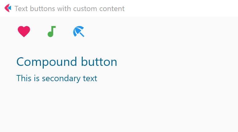
                    ft.Icon(name=ft.icons.FAVORITE, color="pink"),
                    ft.Icon(name=ft.icons.AUDIOTRACK, color="green"),
                    ft.Icon(name=ft.icons.BEACH_ACCESS, color="blue"),
                ],
                alignment=ft.MainAxisAlignment.SPACE_AROUND,
            ),
        ),
        ft.TextButton(
            content=ft.Container(
                content=ft.Column(
                    [
                        ft.Text(value="Compound button", size=20),
                        ft.Text(value="This is secondary text"),
                    ],
                    alignment=ft.MainAxisAlignment.CENTER,
                    spacing=5,
                ),
                padding=ft.padding.all(10),
            ),
        ),
    )


ft.app(main)
Properties
adaptive
If the value is True, an adaptive Button is created based on whether the target platform is iOS/macOS.
On iOS and macOS, a CupertinoButton is created, which matches the functionality and presentation of this button. On other platforms, a Material TextButton is created.
Defaults to False.
autofocus
True if the control will be selected as the initial focus. If there is more than one control on a page with autofocus set, then the first one added to the page will get focus.
content
A Control representing custom button content.
icon
Icon shown in the button.
icon_color
Icon color.
style
Value is of type ButtonStyle.
text
The text displayed on a button.
tooltip
The text displayed when hovering the mouse over the button.
url
The URL to open when the button is clicked. If registered, on_click event is fired after that.
url_target
Where to open URL in the web mode. Value is of type UrlTarget and defaults
to UrlTarget.BLANK.
Methods
focus()
Moves focus to a button.
Events
on_blur
Fires when the control has lost focus.
on_click
Fires when a user clicks the button.
on_focus
Fires when the control has received focus.
on_hover
Fires when a mouse pointer enters or exists the button response area. data property of event object contains true (string) when cursor enters and false when it exits.
on_long_press
Fires when the button is long-pressed.